
Designing Pages
The layout of web pages is an important aspect of site design. Obviously, webpages, and the ways people use them, are different from print pages. Pages need to combine navigation, written content, graphics and other elements so that users can easily see what you have to offer and find what they want.
Here are a few general guidelines for usable page design:
- Provide more content than navigation on each page. Fifty to eighty percent of your page should be content, and Jakob Nielsen suggests that eighty percent is preferable. Remember that people come to your site for the content.
- Critical information and important site identifiers should be included at or near the top of the page. The top left of the page is generally an important focal area of webpages as well as print pages.
- "White space" is important to help guide the user's eye around the page. Don't try to fill every pixel of your page. Often just leaving space is preferrable to creating divisions with graphics or color bars that will only detract from your content and navigation. ("White space" may not be white on the web but whatever your background color is.)
- Make sure that your pages appear quickly in the browser window. Your page content should be visible in one to three seconds. If your pages contain too many large graphics and complicated tables, you page will "load" more slowly. "Load time" is the time it takes for a page and it's contents to be come visible in the browser. Load time is determined in large measure by the speed of the users' connections to the Internet. You should design with the understanding that many users' computers will be much slower than the one on which you are developing.
Using Common Page Grids in Design
You can get a good start on a webpage by using a consistent grid and choosing not to dump print documents onto a Web site. When you're designing a Web page, plan the page layout using a grid. Though there are no hard and fast rules about page layout, several types of layouts predominate on the web. Using an established grid type may be helpful to users who are already familiar using them with them.
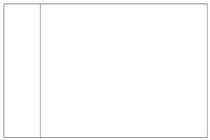 |
One common, and simple, page configurations includes a navigation bar on the left side of the page. Content is displayed to the right. This page layout has been used extensively enough that users have come the anticipate that left side navigation is often "top-level" navigation, or links to main sections of a site. |
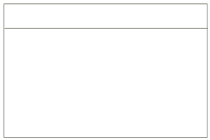 |
Top navigation has also become a popular choice. Content is displayed below the navigation. For this configuration, you need to consider how the content will appear on larger monitors. If you don't control the width of your page, the line length of your content will be too long for people to read comfortably. |
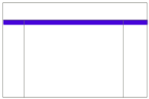 |
Some pages include navigation and other elements on the top and the left or right sides of the page. (and occasionally on the top and both sides as with a number of the search engine and news sites). When you provide navigation and other elements in various locations on the page, it's important make sure that you are consistent about the type of information you include in those areas. The area shaded in blue here is a common location for a horizontal breadcrumb trail. |
Whatever page design you choose, you should repeat site identification and mirror site navigation at the bottom of pages. Other information commonly found at the bottom of pages includes the site author's name, web manager's name, last date updated, and/or contact information.
Be careful that your page doesn't become "top heavy," with excessive graphics at the top that do little to help the reader situate themselves, navigate, or receive information. Top heavy banners often push important content too far down the page, below the visible screen. If users don't scroll down, they may miss something important.
Frames or No Frames
Grids can be created by using tables or "framesets," which are groups of separate pages arranged to fit on the screen simultaneously. The benefit of a frameset is that you can keep some frames in place while others change. An example of frames is the WebCT part of this course. However, there are several drawbacks to frames:
- Not all browsers can manage frames well or consistantly.
- Frames make bookmarking specific content difficult. The same problems that make bookmarking difficult cause problems for search engines, which means that some content is unindexed or improperly indexed.
- Printing from frames can be confusing. Users can print from each frame individually but can't print everything on the screen.
- Frames do not work well for people with visual disabilities who use screen readers.
- Some of these problems are improving, but you'll notice that many large company websites and web development sites avoid frames, at least at the top levels of their sites.
Framesets can solve some design problems. If you consider using frames, thoroughly evaluate your purposes and audiences and weigh the benefits and drawbacks. (Using framesets is an advanced design topic that we do not cover in this module.)
I no longer use frames as many types of solutions have rendered them unecessary and a bit dated.
Scrolling and Page Size
Browsers, by default, display web page content horizontally to fit within browser windows. The length of a web page, or number of screens that you need to scroll down to reach to bottom of the page, is determined by how much content you include on the page. One option is to design pages that will display correctly regardless of how they are resized by browsers. This type of design is called "resolution independent." When you choose this type of design, make sure that you don't end up with long lines of text that take up the whole monitor. This is especially annoying on new, larger monitors.
You can control the size and position of your content in the browser window using tables. Tables allow you to set a specific widths and heights for content areas and can be positioned so that they are aligned left or right, or centered in the browser window. Sizing and positioning is important because of variations in monitor sizes. Small monitors can generally display information that is 640 pixels wide by 480 pixels high on one screen. (A "pixel," short for Picture Elements, is the unit of measurement for webpage elements and monitor screen size. The exact size of a pixel is tied to resolution.) Larger monitors can display 800 by 600 pixels or more. In addition, how users set the preferences for their browsers can make a difference in the display. Since you cannot control all the variations in users' hardware and software, consider designing for smaller screens. A size of 600-640 pixels wide will generally work for all monitors. (This page is set to a 640 pixel width.) Designers will often set the width of the page, but leave the height (which can be thought of as the length of the page) open because pages "flow" down to accommodate the content.
Ensuring that all the content appears on the screen horizontally is critical. General consensus among user testing experts is that people accept a reasonable amount of top-to-bottom page scrolling, which is actually preferable to excessive "click through." Left to right scrolling in almost all cases is not tolerated well at all.
|
Read "In Search of the Elusive Interface," a useful article about page composition and balancing design and usability. By Molly E. Holzschlag on webtechniques |