Scatterplots
for Econ 3343 Course Project
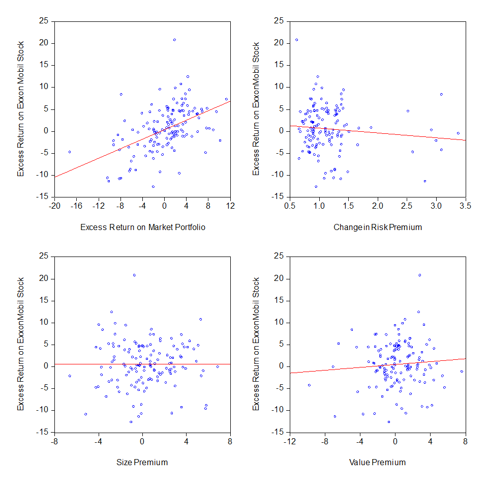
The four
scatterplots in THIS FILE look like:
This was
created in EViews as follows:
1. Hold down the CTRL key and
left-click on ‘er_mkt’ and ‘er_r’.
2. Continuing to hold down the CTRL
key, right-click ‘Open’, then right-click on ‘as Group’.
3. Then left-click on ‘View’,
‘Graph’, ‘Scatter’, and in the ‘Fit Lines’ window click on ‘Regression line’.
4. After the graph pops up, click on
‘Freeze’ and then ‘Name’; I suggest that you accept the default name of
‘graph01’.
Carrying out
steps 1-4 three more times, but changing Step 1 as follows: (a) instead of ‘er_mkt’
use ‘crp’; (b) instead of ‘er_mkt’ use ‘smb’; (c) instead of ‘er_mkt’ use ‘hml’.
At this point you’ll have four graphs, named ‘graph01’, ‘graph02’, ‘graph03’,
and ‘graph04’. Next, you need to edit the labels along the axes of the graphs;
for ‘graph01’, the horizontal-axis label is ‘er_mkt’ and the vertical-axis
label is ‘er_r’. You can this for each graph as follows: (a) left-click on the
graph name to open it; (b) click on an axis label – this allows you to reset
what EViews calls the ‘legends’ of the graph; (c) on the right side of the
‘Legends’ box, you can ‘Edit legend entries’ by successively selecting the two
different legend entries, e.g., in ‘graph01’, change ‘er_mkt to ‘Excess Return
on Market Portfolio’ and ‘er_r’ to ‘Excess Return on xxx’, where ‘xxx’ is the
name of the corporation whose stock you’re analyzing.
After you’ve
properly edited the legends for each of the four graphs:
5. Holding the CTRL key down,
left-click on each of the four graphs and then right-click ‘Open’. This will
give you a graph like the one above.
Last
updated: March 29, 2013. Link to: Econ 3343 Course
Description. Link to: Econometrics
Home Page.